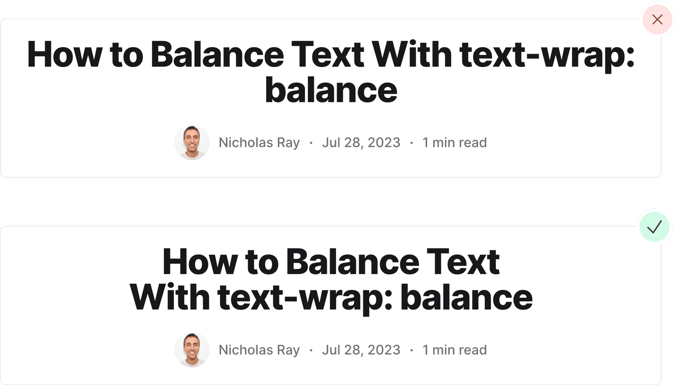
How to Balance Text (Without JavaScript)
So you have headlines on your site that wrap only one or two words to the next line at a certain breakpoint, looking uneven and awkward. They would look much better if they were balanced — the amount of text on each line should be about the same when it wraps.

Now there's a way with CSS:
h1 { text-wrap: balance; /* You need to set a max-width as well, but it doesn't need to be * 1000px */ max-width: 1000px;}Check out the video below to see how it works:
Browser with a headline on the page that initially spans on line. When the browser decreases its width, the text wraps to two lines with about the same amount of text on each line.
Advantages
Before using this, you had to either:
- Do nothing. 🙈
- Use JavaScript like the 2.2 KB balance-text library. But even a small amount of JS can slow down a page.
- Manually place
<wbr>or­tags at the positions you want the browser to break a line. But that's tedious.
Limitations
Browser support
It's an experimental property that currently has limited browser support.
Mainly, only recent versions of Chrome and Edge support it. Still, I'd rather half of the population see nice headings than 0%.
Be careful
Using this property for a small number of elements is fine. Even the following could work:
h1,h2,h3,h4,h5,h6 { text-wrap: balance;}But don't try to balance every line of text on the page because it will slow down its rendering performance.
The browser needs to do a lot of work to balance the text, so use it sparingly.
Only works for a few lines
The spec allows browsers to skip balancing if there are more than ten lines of text. Chromium browsers will only balance 4 lines or less.
So applying it to headings and pull quotes are the best use case.
Conflicts with white-space property
The following won't work as they are contradicting properties:
h1 { white-space: nowrap; text-wrap: balance;}The white-space property instructs the browser not to wrap the text,
while text-wrap tells the browser it's okay. The result is unbalanced
text.
To balance the text, remove the white-space property.
