How To Fix "Image elements do not have explicit width and height"
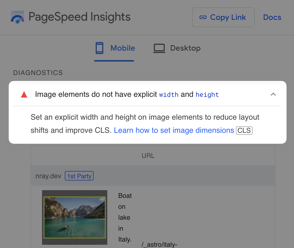
PageSpeed Insights and Lighthouse audits will flag any "unsized" image with the message, "Image elements do not have explicit width and height."
So how do you fix it?
Generally, you need to add width and height attributes to each
image so the browser knows its aspect ratio before loading it:
<img width="704" height="469" src="…" alt="…" />In this post, you'll learn how to fix an image failing this audit.
Why does this matter?
By default, browsers only allocate space for an image after it has downloaded its dimensions. Before that point, the image doesn't occupy any space on the page.
This becomes a problem if the browser renders a page before it knows the aspect ratio of an image in the viewport. Why? After the browser figures out the image's aspect ratio, it will allocate space for it by pushing down all the elements and text below it, causing a Cumulative Layout Shift (CLS).
Loading a page with an unsized image causes a large Cumulative Layout Shift.
You may have experienced annoying layout shifts when visiting websites with ads that load late and push down other elements on the page. Trying to read text or interact with an element that gets shifted, like a button, can be incredibly annoying. Layout shifts like these frustrate users.
Now, let's look at an example.
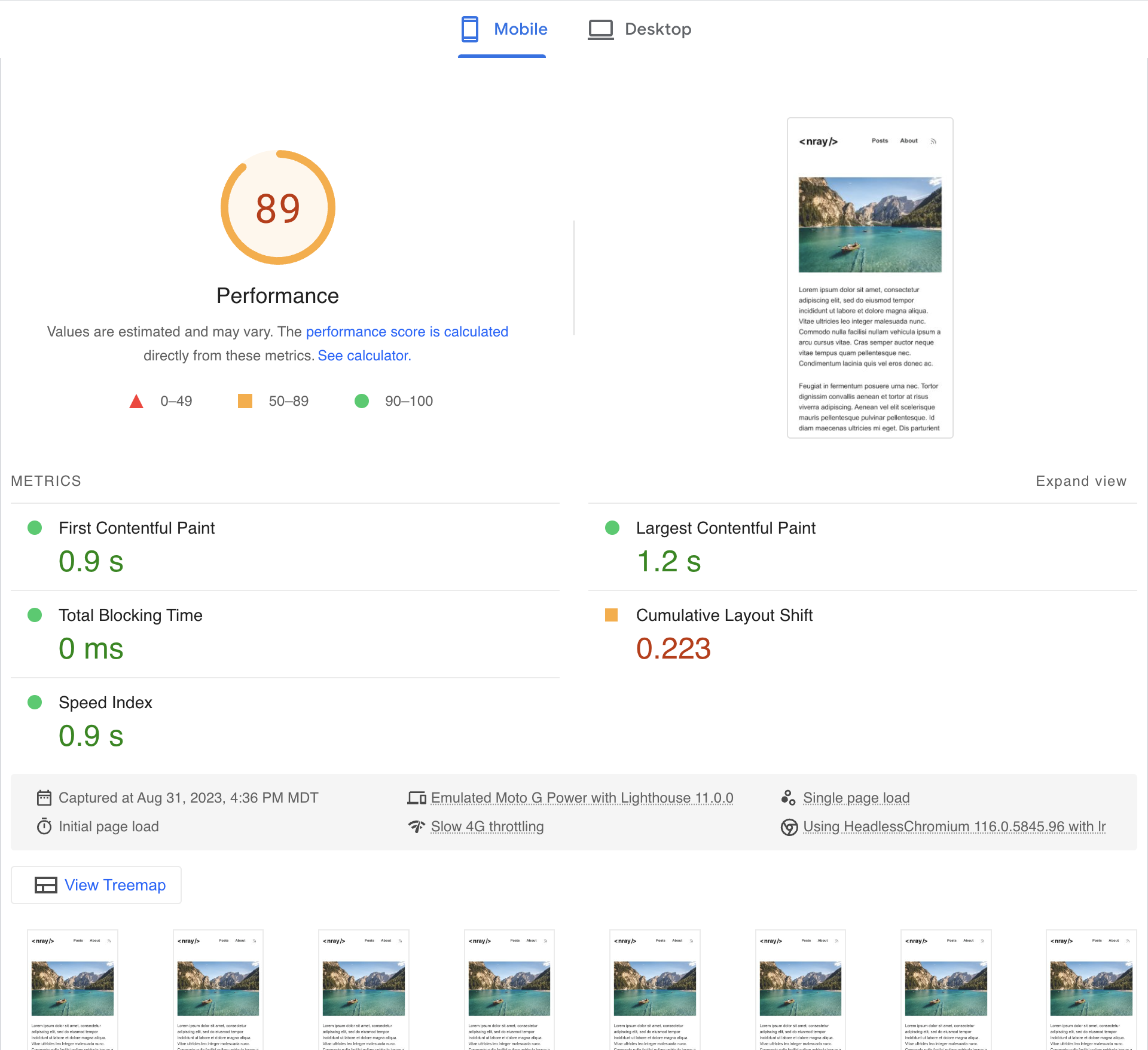
Step 1: Measure the baseline
Let's start by running a PageSpeed Insights audit of this demo page, featuring an unsized image with some text below. What are the results?
- CLS: 0.223
- Total: 89
Step 2: Add width and height attributes and CSS
Fixing <img> elements
Get the image's dimensions in pixels and add width and height
attributes to the image with these values. Make sure to not include
the px unit. Because the image in the demo has a width of 704 px and
a height of 469 px, the HTML should look like the following:
<img width="704" height="469" src="…" alt="…" />And then add some CSS:
img { /* Allow the image's height to scale to the aspect ratio inferred * from the `width` and `height` attributes */ height: auto; /* Make the image fill the width of the container */ width: 100%;}Alternatively, you can use the
aspect-ratio
CSS property instead of adding the width and height attributes:
<img class="hero" src="…" alt="…" />.hero { aspect-ratio: 704 / 469; height: auto; width: 100%;}Fixing <picture> elements
You can also apply width and height attributes to images using the
<picture> element. For example, you could use the <picture>
element to
serve different formats:
<picture> <!-- Load the AVIF, if supported --> <source type="image/avif" srcset="…" /> <!-- Otherwise, load the WebP, if supported --> <source type="image/webp" srcset="…" /> <!-- Fallback to the JPEG from the <img> element --> <img src="fallback.jpg" width="704" height="469" alt="…" /></picture>If the aspect ratio remains constant for all the <source> elements,
you don't need to add width and height attributes to each one. But
if the aspect ratio changes, there is good
browser support
for that, too:
<picture> <!-- Use square image on smaller screens --> <source media="(max-width: 999px)" srcset="…" width="500" height="500" /> <!-- Use rectangle image on larger screens --> <source media="(min-width: 1000px)" srcset="…" width="704" height="469" /> <!-- Fallback to using the rectangle image --> <img src="fallback.jpg" width="704" height="469" alt="…" /></picture>Step 3: Measure the impact
With the width, height, and CSS added, let's use PageSpeed
Insights to measure the impact of a
page after these changes:
- CLS: 0
- Total: 100
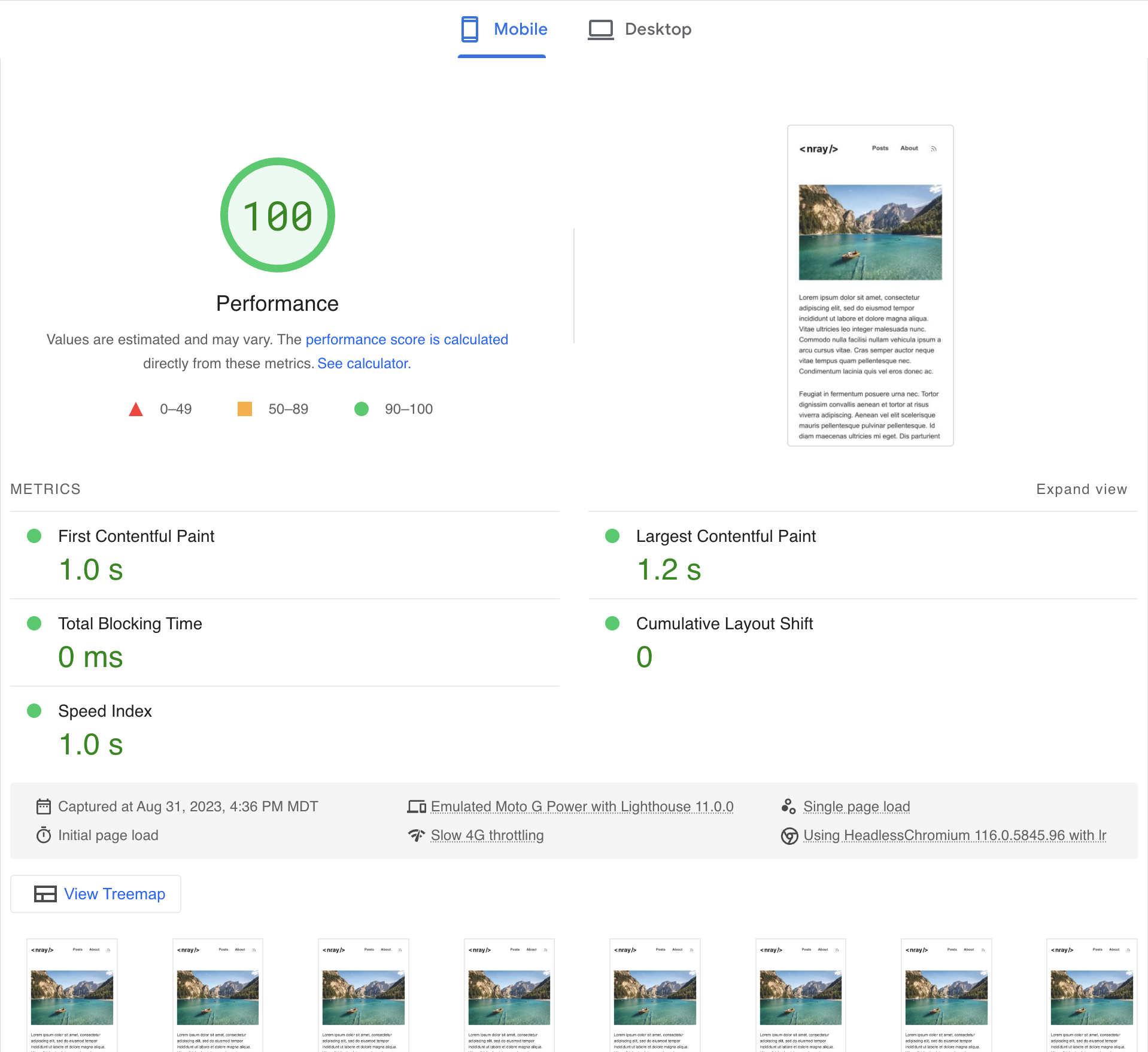
That's better! We've eliminated the Cumulative Layout Shift, and the page has a perfect score. Sometimes, minor CSS and HTML changes like these can go a long way in improving the user's experience.