How To Serve Images in Next-Gen Formats
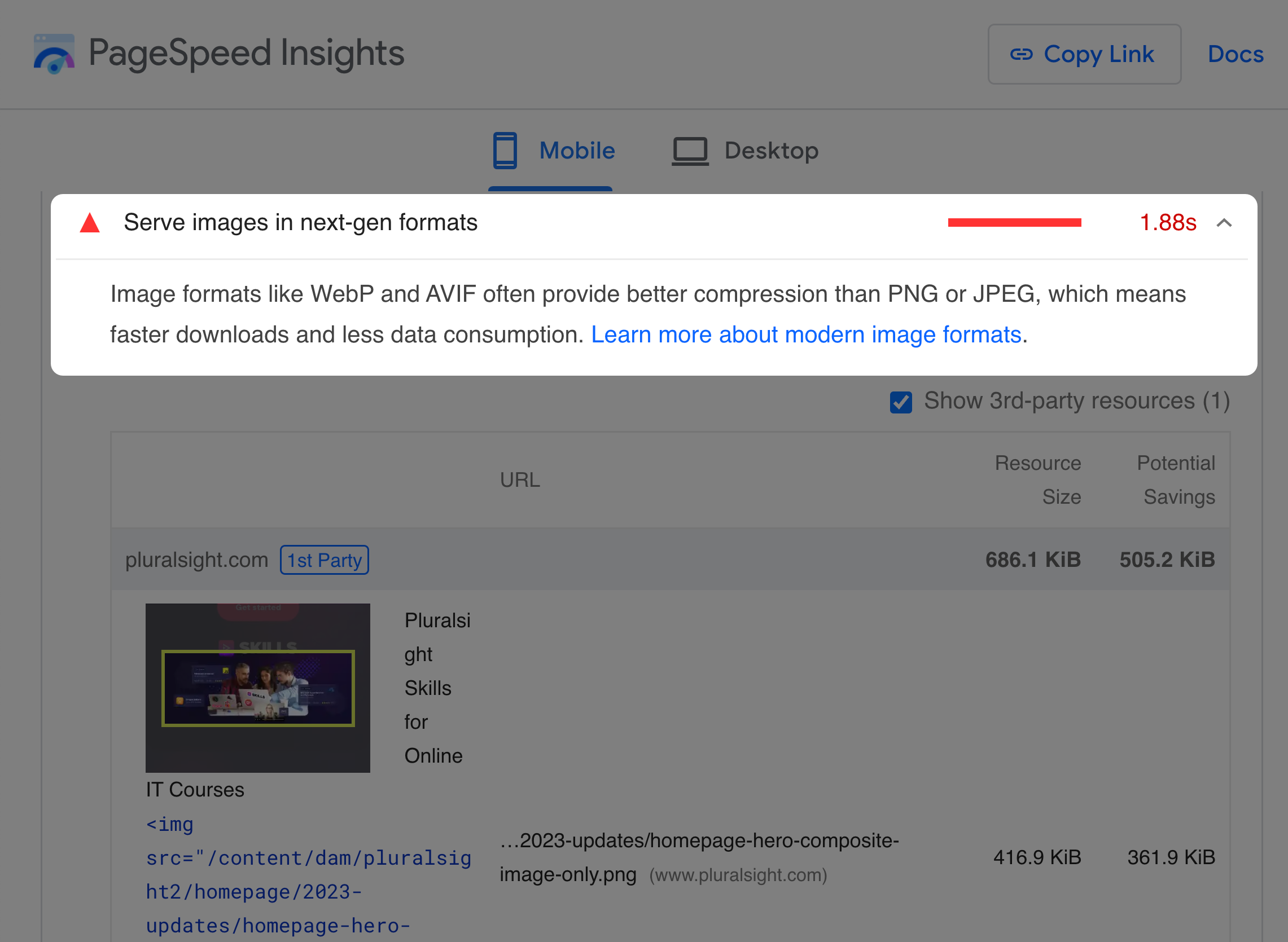
Running a Lighthouse or PageSpeed Insights audit on your website may warn you to "Serve images in next-gen formats." The audit flags images that could have been at least 8 KiB smaller with a newer format like WebP or AVIF.
So how do you fix it? Generally, you need to convert your JPEG and PNG images to WebP or AVIF, as they typically result in faster load times while maintaining excellent quality.
Using older formats like JPEG, PNG, or GIF for all your images will likely slow down your site. In this article, I'll explain your options for serving the newer formats.
Why does this matter?
The JPEG and PNG formats were released over 25 years ago. Since then, people developed newer formats with better compression, resulting in smaller file sizes, faster download times, and less bandwidth consumption.
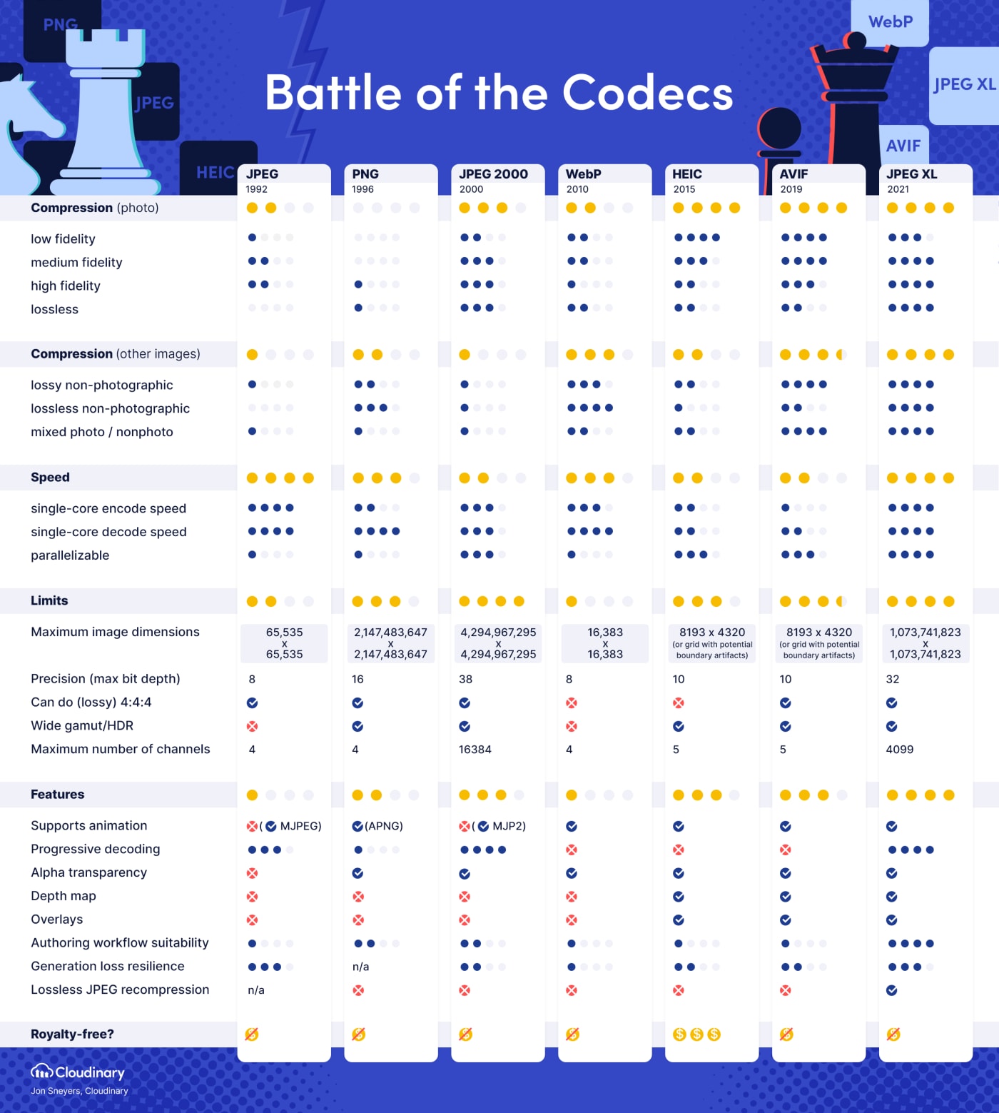
What new formats have the best browser support?
WebP and AVIF currently have the best browser support:
| Format | Initial Release | Browser support (in Aug 2023) |
|---|---|---|
| GIF | 1987 | ~100% |
| JPEG | 1992 | ~100% |
| PNG | 1996 | ~100% |
| JPEG 2000 | 2000 | 20.14% |
| WebP | 2010 | 96.76% |
| HEIC | 2015 | 0.03% |
| AVIF | 2019 | 85% |
| JPEG XL | 2021 | 0.03% |
There was a time when WebP had much lower browser compatibility. But now, all modern browsers support WebP, including the latest versions of Safari. AVIF has also seen a steady increase of browser support.
Check caniuse for the latest WebP and AVIF compatibility.
How do next-gen formats improve performance?
Smaller image file sizes result in faster download times since the browser has fewer bytes to download. But how much smaller are WebP and AVIF compared to PNG and JPEG? It depends on the image. Several studies show huge improvements, though:
- WebP file sizes were 23% smaller than PNG with the same visual quality in a study from Google.
- WebP file sizes were 25%-34% smaller than JPEG with the same visual quality in another study from Google.
- AVIF showed much better compression efficiency than JPEG in a study from Netflix.
- AVIF had significantly better compression compared to WebP and JPEG in a study from Google.
The proper image format can significantly improve your website's load time, especially when combined with other techniques like lazy loading images. You can use Cloudinary's image analysis tool on your website to see the file size differences you might get from picking the correct format and compression.
Since images are commonly the largest element above the fold, images that load fast can also improve your Largest Contentful Paint (LCP) time — a Core Web Vital that affects your website's search engine ranking on Google.
How do I serve WebP or AVIF?
Ultimately, your strategy to serve WebP or AVIF depends on your desired optimization level, browser compatibility requirements, and technical stack.
Option 1: Only serve WebP
Given that WebP now has good browser support, the simplest option is to always save or convert your raster images to WebP format using one of the following methods:
- Manually save and compress each image to WebP with a tool like Squoosh that lets you see the impact on quality and file size.
- Bulk convert using a tool like sharp or cwebp.
Once converted, you can use WebP with the standard image element:
<img src="/cat.webp" width="200" height="200" alt="A sitting cat" />But there are a couple of downsides to this approach:
- You are likely missing out on (much) smaller file sizes that you might get from the less supported AVIF format.
- Users with browsers that don't support WebP won't see any image that uses the WebP format.
So how can you solve both of these issues?
Option 2: Serve different formats with HTML
You can save multiple image formats using the same tools mentioned above. For the most optimized image supporting the most extensive set of browsers, save to AVIF, WebP, and JPEG (or PNG) formats.
Then, let the browser decide which format to load using HTML like the following:
<picture> <!-- Load the AVIF, if supported --> <source type="image/avif" srcset="/cat.avif" /> <!-- Otherwise, load the WebP, if supported --> <source type="image/webp" srcset="/cat.webp" /> <!-- Fallback to the JPEG from the <img> element --> <img src="/cat.jpg" width="200" height="200" alt="A sitting cat." /></picture>The order of the <source> and <img> elements is essential as the
browser will load the first supported format starting from the top.
For example:
- If the browser supports AVIF, the AVIF loads from the first
<source>element. - If the browser doesn't support AVIF but supports WebP, the WebP
loads from the second
<source>element. - If the browser doesn't support AVIF or WebP, the JPEG loads from the
third
<source>element. - If the browser doesn't support the
<picture>element (IE11), the JPEG loads from the<img>element.
In practice, offering multiple formats can quickly become complex when you want responsive images as well. The relatively simple markup from above turns into something like this:
<!-- Supporting different image formats is easy and fun 😭 --><picture> <source srcset=" /img/cat-1920w.avif 1920w, /img/cat-1280w.avif 1280w, /img/cat-640w.avif 640w, /img/cat-320w.avif 320w " sizes="(max-width: 500px) 100vw, 750px" type="image/avif" /> <source srcset=" /cat-1920w.webp 1920w, /cat-1280w.webp 1280w, /cat-640w.webp 640w, /cat-320w.webp 320w " sizes="(max-width: 500px) 100vw, 750px" type="image/webp" /> <!-- Add the src attribute for older browsers that don't support `srcset` --> <img src="/cat.jpg" srcset=" /img/cat-1920w.jpg 1920w, /img/cat-1280w.jpg 1280w, /img/cat-640w.jpg 640w, /img/cat-320w.jpg 320w " sizes="(max-width: 500px) 100vw, 750px" width="200" height="200" alt="A sitting cat." /></picture>The increased HTML size should compress well if your server supports HTTP compression like GZIP or Brotli. But saving or converting to all of these different sizes and formats can be painful.
What can you do instead?
Option 3: Serve different formats with content negotiation
The third option is to use JPEG or PNG and have logic on the server to
do the heavy lifting. How does this work? When requesting an image,
the browser tells the server what formats it supports via the Accept
header.
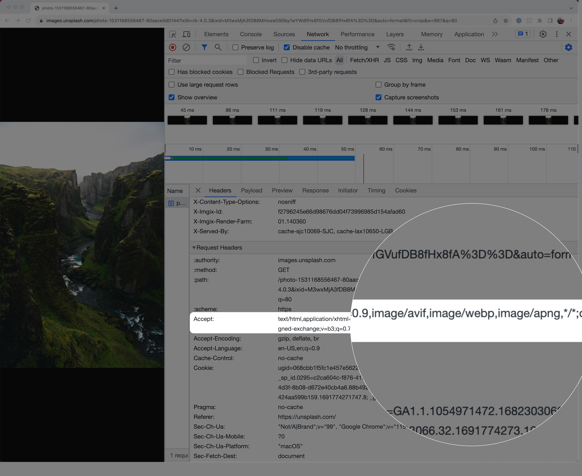
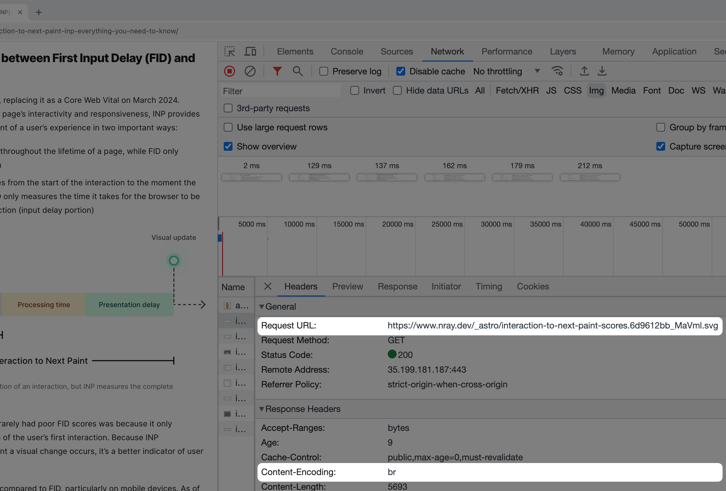
The server uses this header to send back the most optimized and compatible image, even if it is in a different format than the one requested. This process is called content negotiation, but what this means is that you can save a high-quality image as a JPEG or PNG and just use that in your HTML. Even if you want responsive images, the markup becomes relatively simple:
<img src="/cat.jpg" width="200" height="200" alt="A sitting cat." srcset=" /img/cat-1920w.jpg 1920w, /img/cat-1280w.jpg 1280w, /img/cat-640w.jpg 640w, /img/cat-320w.jpg 320w " sizes="(max-width: 500px) 100vw, 750px"/>With content negotiation, adding extra HTML to support different formats is unnecessary. The server will choose the best format, typically a WebP or AVIF, and send that back to the user. This is the strategy I'm using on this site.
How do you use content negotiation?
How to use content negotiation
First, your technical stack may already have a service or plugin with content negotiation that you can use. For example, the NextJS framework ships with an image optimization API that uses content negotiation to choose the best format the browser supports.
Although it's not free, you may already be on a CDN like Cloudflare, Fastly, or Akamai that offers an image service with content negotiation.
Finally, dedicated image CDNs like Cloudinary or imgix are also popular options that use content negotiation.
Ideally, the image's URL should point to the same domain that your
website uses instead of something like
https://res.cloudinary.com/.../cat.jpg. If it's different, the
browser must spend extra time setting up another connection, which can
negate the benefits of image optimization. One option to get around
this is to
proxy image requests
from your domain to the image service.
What about SVGs?
Despite being over 20 years old, SVGs still have a place on the web for images composed of simple lines, points, polygons, and text. Icons, logos, and simple illustrations are often good use cases for the SVG format.
Why is this format still relevant? Unlike raster images like AVIF,
WebP, PNG, JPEG, which encodes pixels in a rectangular grid, the SVG
format uses points, lines, curves, and polygons to make an image that
is sharp at any resolution and zoom level. As a result, the HTML for
external SVGs is simple without needing to add any responsive
attributes like srcset and sizes:
<img src="/cat-logo.svg" width="200" height="200" alt="A sitting cat."/>If you use SVG images, be sure to do the following to make SVGs as small as possible:
- Optimize SVGs with a tool like SVGO
- Ensure your website's server has HTTP compression like GZIP or Brotli enabled for SVGs
Serving images in WordPress
- WordPress 5.8+ can upload and use WebP images
- A
proposal
to automatically convert JPEGs to WebP and make WebP the default
format was
controversial. The
community raised concerns about
disk space and compatibility. Although both tickets associated with these issues are now resolved, it's unclear when or if this will land in the core WordPress platform. For now, using a plugin that does automatic conversion or content negotiation is an option.
Conclusion
Newer image formats can drastically reduce image sizes and improve load times. Each format has its strengths and weaknesses, but in general:
- Prefer
<video>elements over animated GIFs. Most of the time, the compressed video will be significantly smaller. - Prefer SVG for images composed of relatively simple lines, points, polygons, and text. Icons, logos, and simple illustrations are usually good use cases for the SVG format.
- Prefer WebP and AVIF over JPEG and PNG for photos and screenshots.
- Test which format is best with a visual tool like Squoosh when in doubt.
Finally, how you serve the newer formats depends on your desired optimization level, technical stack, and browser compatibility requirements. Most people will likely find using an image service with content negotiation the best balance of performance and ease.