How to Defer Offscreen Images In 2023
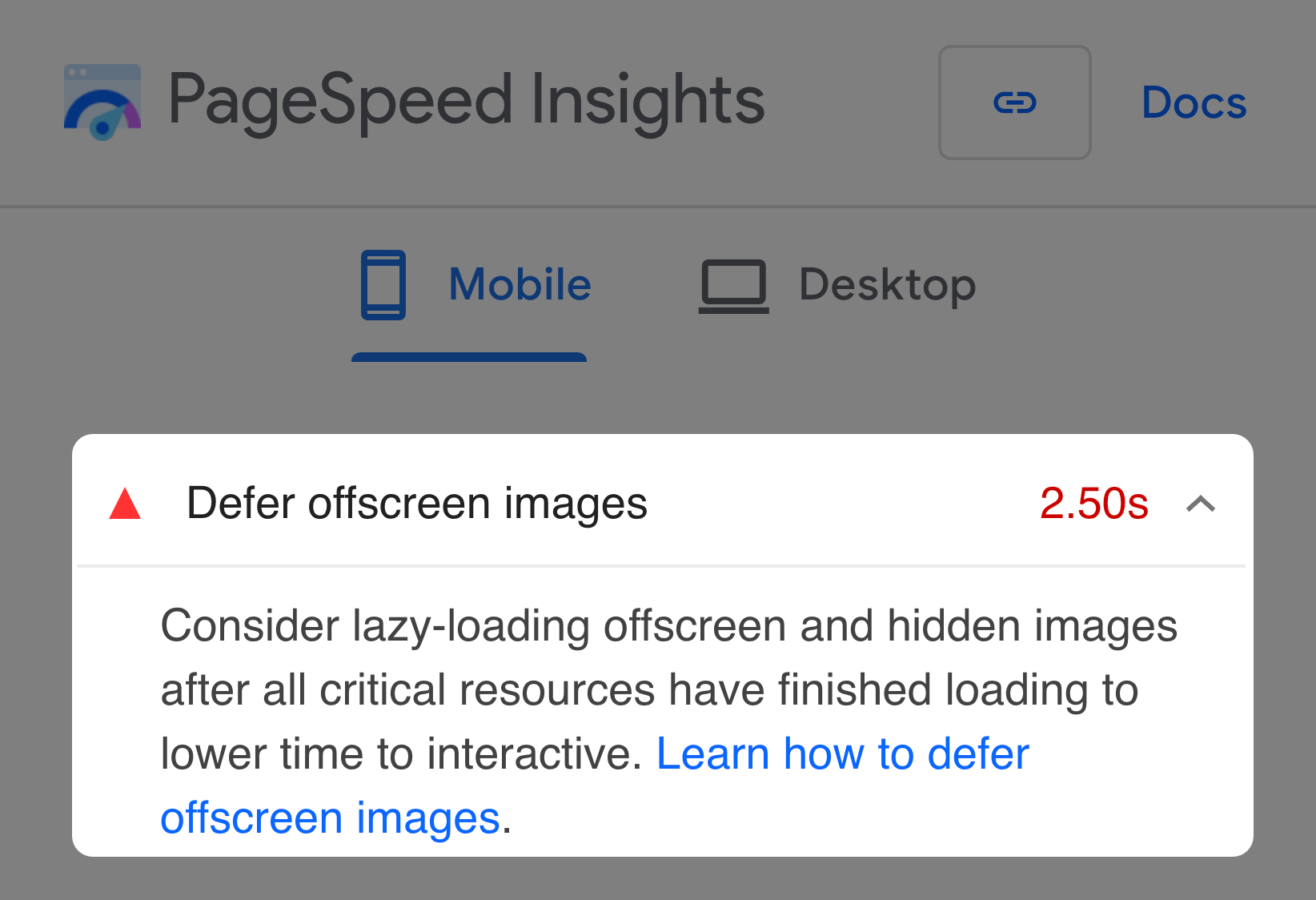
So you run a Lighthouse or PageSpeed Insights audit on your website, and it complains that you should "Defer offscreen images," advising you to "lazy-load offscreen and hidden images."
How do you fix it? You need to add the loading="lazy" attribute to all
image elements below the fold.
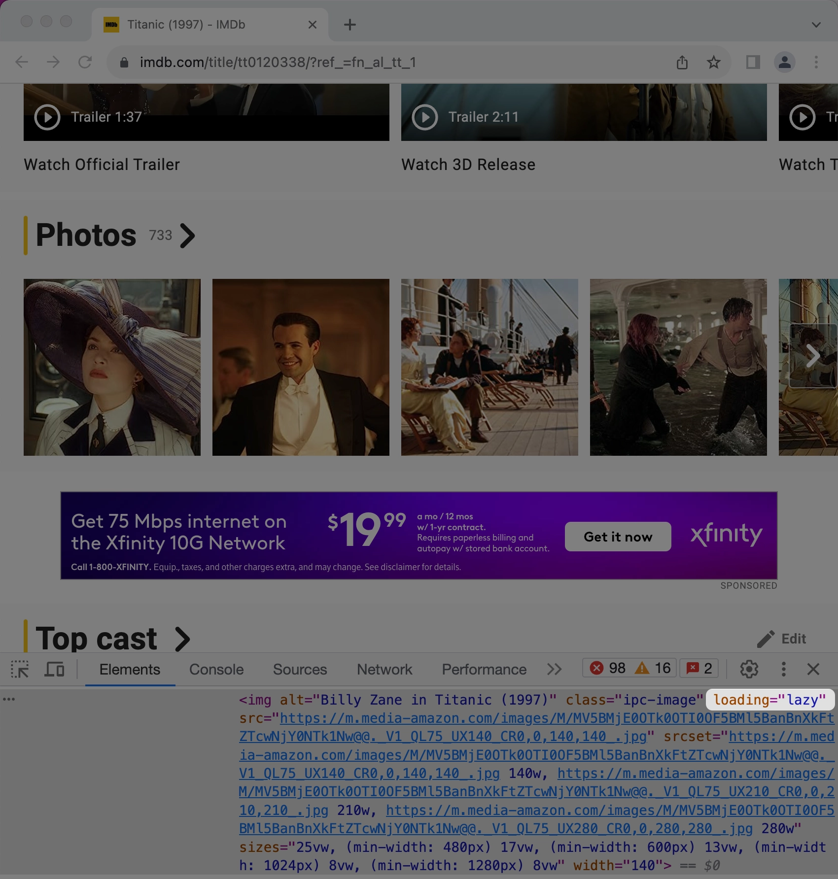
This technique is used by some of the biggest sites in the world, including Medium, LinkedIn, and IMDb. In this article, I'll show you how it's done.
What are lazy-loaded images?
Without lazy loading, the browser will load all images it finds in your page's HTML, even if the user never sees them.
But lazy-loaded images don't begin loading until they are near the browser's viewport — the rectangular area you see on the screen. They don't load until they are needed.

So if a user visits a website with offscreen images, each image will only be downloaded if and when the user scrolls near it.
Why can't I load all my images during page load?
In short, it's a waste of resources. It leads to:
- Longer load times
- Higher mobile phone data costs for your users
- Higher bandwidth costs for you and the host of your website
- Browser resources that could have been used for other (more important) things
According to HTTP Archive, images are the most popular asset on the web, so loading them efficiently is essential.
What does that look like?
How to lazy-load images
Use native lazy loading
There was a time when JavaScript was the only method for lazy loading images. Then, browsers implemented a way to do it using an HTML attribute. But browser support wasn't good, so most websites continued to use JavaScript.
Times have changed. All modern browsers now support lazy loading,
including Safari. Browser support is currently
93% of global users, which is good
enough for most websites. All you have to do is add a loading="lazy"
attribute to each image you want lazy-loaded:
<!-- below-the-fold image -->
<img src="image.png" loading="lazy" alt="…" width="500" height="500" />
Browsers that don't support the attribute will ignore it and load images the default way — during page load — so it degrades gracefully.
As of July 2023, only around 27% of desktop and mobile sites use this feature. The rest either load their images during page load or use JavaScript to lazy-load them. But JavaScript can cause responsiveness issues, so it's better to use the HTML attribute when possible.
That's it! But keep reading because there are some caveats.
Don't lazy-load images above the fold
You should only lazy-load images "below the fold" — the part of the page that is hidden before scrolling.
Images that are above the fold will load quicker by omitting the
loading attribute:
<!-- above-the-fold image -->
<img src="image.png" alt="…" width="500" height="500" />
Why? Using the loading="lazy" attribute for images above the fold will
unnecessarily delay when they start loading since the browser must first
load all of the page's CSS to determine whether the image is near the
viewport. Omitting the attribute allows the browser to start loading them
as soon as it finds them in the HTML, even before loading any CSS, which
means the user can see them faster.
Finding above-the-fold images can be tricky since "the fold" is relative to the device — images that appear above the fold on laptops are not necessarily above the fold on mobile devices. My advice? Use your website's most popular viewport sizes on desktop and mobile devices and your better judgment to determine which images you should lazy-load.
Following this advice will make your above-the-fold images load relatively quickly, but what if some images above the fold are more important than others?
Optimize the Largest Contentful Paint (LCP) image
Largest Contentful Paint (LCP) is a Core Web Vital metric that measures how quickly the largest image or text block becomes visible within the viewport. Images are the most common type of LCP element.
Omitting the loading="lazy" attribute for above-the-fold images within
the viewport is a good start to better LCP scores, but you can do more:
- Find the largest image that is above the fold.
- Add a
fetchpriority="high"attribute to it.
<!-- LCP image -->
<img
  src="image.png"
  fetchpriority="high"
  alt="…"
  width="200"
  height="200"
/>
The fetchpriority="high" attribute signals to the browser that the image
is more important than other images and to prioritize it. But only use
this attribute for the largest above-the-fold image on the page.
Prioritizing many images can lead to bandwidth contention, defeating the
purpose of prioritization.
Note that browser support for this attribute isn't good right now, but browsers without support will ignore it.
How to lazy-load background images
Native lazy loading doesn't work for images in CSS that use the
background-image property:
.image {
  /* Can't lazy-load without JS */
  background-image: url("image.png");
}
If you want to lazy-load background images, you will need another strategy.
First, consider replacing the background image with an image that uses the
object-fit: cover CSS property and uses native lazy loading:
<img
  class="image"
  src="image.png"
  loading="lazy"
  alt="…"
  width="200"
  height="200"
/>
.image {
/* Mimics `background-size: cover` property */
object-fit: cover;
}If this isn't possible (and make sure it isn't because most of the time it
is), you will need to use JavaScript. The most efficient way to do it is to
use IntersecionObserver to remove a class:
<div class="bg-image lazy"></div>.bg-image {
width: 500px;
height: 500px;
background-image: url("image.png");
}
.lazy {
/* Overrides the preceding `background-image`. Prevents loading the
* image until IntersectionObserver removes the .lazy class. */
background-image: none;
}// Get all background image elements with the .lazy class.
const images = Array.prototype.slice.call(
document.querySelectorAll(".lazy"),
);
// Check if browser supports IntersectionObserver.
if (window.IntersectionObserver) {
const observer = new IntersectionObserver(
(entries) => {
entries.forEach((entry) => {
// If element is within the viewport, load its background
// image.
if (entry.isIntersecting) {
// Load background image by removing the .lazy class.
entry.target.classList.remove("lazy");
// Stop observing an element whose image will already be
// loaded.
observer.unobserve(entry.target);
}
});
},
// Distance from viewport to start loading the image. We don't
// want to start loading when the image is in the viewport because
// then the user has to wait on the image to download.
{
rootMargin: "400px",
},
);
images.forEach((image) => {
observer.observe(image);
});
}Defer offscreen images in WordPress
WordPress has been steadily improving image loading without needing any additional plugins:
- WordPress 5.5+
automatically adds the
loading=lazyattribute to images withwidthandheightattributes. - WordPress 5.9+
automatically omits the
loading=lazyattribute for the content's first image, which usually appears above the fold. - WordPress 6.3+
automatically adds the
fetchpriority=highattribute to the image it determines is the most likely LCP.
Conclusion
Deferring your offscreen images is now easier than ever with native lazy loading in the browser. Just keep in mind these constraints:
- Lazy-load images with the native
loading="lazy"attribute. - Only lazy-load below-the-fold images. Above-the-fold images should not
have the
loadingattribute. - Improve your LCP time (in supporting browsers) by adding
fetchpriority="high"to the LCP image. - Native lazy loading doesn't work for background images. Either replace
with an image element or use
IntersectionObserverto lazy-load those. - Serve the best image format for the fastest load times.
Here's a cheatsheet summarizing most of these points:
<!-- above-the-fold LCP image -->
<img
  src="image.png"
  fetchpriority="high"
  alt="…"
  width="500"
  height="500"
/>

<!-- above-the-fold image that isn't the LCP -->
<img src="image.png" alt="…" width="500" height="500" />

<!-- below-the-fold image -->
<img src="image.png" loading="lazy" alt="…" width="500" height="500" />

<!-- below-the-fold background image, requires JS and CSS -->
<div class="bg-image lazy"></div>